We will understand Exploratory Data Analysis (EDA) in machine learning in the context of vacation planning. Just as you research a destination before booking, EDA helps us understand our data before diving into building ML Algorithms. It’s about discovering patterns and insights to make informed decisions on approaching our machine-learning journey, just like we would for a vacation.
EDA is a critical step in machine learning. Exploratory data analysis, data preprocessing, and feature engineering collectively require approx. 80 % of your time during the machine learning developments.
Table of Contents
ToggleWhat is Exploratory Data Analysis?
Exploratory Data Analysis or EDA is an approach to determine key attributes, get insight, determine patterns in data, spot anomalies, and identify relationships between variables in raw data using numbers, tables, and graphs. It is always a good practice to know about the data before you start working on it.
EDA is different from data pre-processing or data wrangling and feature engineering. It is the first step we do before any changes in raw data. Exploratory Data Analysis is input for data pre-processing, feature engineering, and machine learning model selection.
Exploratory data analysis is an iterative process and goes in parallel with data pre-processing and Feature engineering.
Objective of EDA
We do exploratory data analysis on raw input data for machine learning to achieve the following objectives:
- Understand Data
The first step with our data is getting to know it well. Exploratory Data Analysis (EDA) is like a getting introduction to our data. It guides us in developing and selecting the best machine-learning algorithm by uncovering insights and understanding what’s under the hood.
- Volume of data (Number of observations)
- Number of features
- Data Structure
- Data Type (Float, integer, string)
- Determine Categories in data
2. Check Assumptions For ML Model Developments
Machine learning models make some assumptions during training and predicting unknown instances. Summary stats and graphs are used to check assumptions on data. It’s like making sure the players know the game before they start playing.
3. Descriptive Statistics
We use descriptive statistics to summarize the characteristics of a sample using quantitative techniques. We can use the following measures to get insights on data:
- Mean, mode and standard deviation, and Percentile
- Variability and distribution of variables in data
We can use the above understanding of data to determine outliers in features.
4. Data Visualization
EDA utilizes visual techniques to get insights from data. Visualization techniques include:
- Scatter Plot
- Line Plot
- Histogram
- Box Plot
- Heat map
- Bar carts
5. Correlation in data
EDA helps in discovering relationships between variables. Here is the list of techniques we can use to determine the correlation between variables:
- Correlation analysis
- Scatter plots
- Pass-tabulations
The correlation in data helps in the selection of the right features for machine learning
6. Generate Hypothesis
The findings from EDA are used to generate hypotheses for statistical testing, and ML model evaluation.
7. Determine Data Quality
We take the info from EDA to check how good and dependable our data is. It’s like giving our data a quick check-up. This helps us set clear goals for building our machine-learning models.
Types of EDA
We can group exploratory data analysis techniques into three types based on the number of things we’re looking at—whether it’s one, two, or many. It’s like sorting them into different buckets depending on how much we’re dealing with.
- Univariate Analysis
- Bivariate Analysis
- Multivariate Analysis
Univariate Exploratory Data Analysis
In univariate exploratory data analysis, we only focus on the characteristics of a single variable at a time. In other words, univariate analysis analyses a variable in isolation from other variables. Here are some common techniques we use for univariate analysis:
Descriptive and Summery Statistics
Descriptive Statistics in the univariate analysis include the following parameters:
- Central Tendency: We can use Mean, Median, and Mode of the variable to determine data central tendency.
- Range: It is the difference between minimum and maximum values in data.
- Variance and Standard deviation: Variance and standard deviation measure the spread in the data points. The higher the spread, the higher will be the standard deviation, and vice-versa.
- IQR (Interquartile Range): Identifies outliers based on the spread of the middle 50% of the data.
# Determine descriptive Statistic for All columns with Numerial data
stats_df=data.describe()
print(stats_df)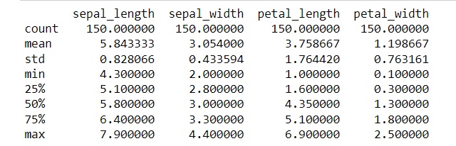
The above table does not include the range. We can add the additional row using the following code
# Add range row in Descriptive Tabele
stats_df.loc['range'] = stats_df.loc['max'] - stats_df.loc['min']
print(stats_df)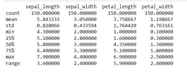
Summary statistics summarize a set of data. They provide a general understanding of the information about sample data.
- Skewness: It measures the asymmetry of a distribution.
- Kurtosis: It measures the “tailedness” of a distribution.
# Calculate Skewness and Kurtosis in data
skewness_data = data[['sepal_length', 'sepal_width', 'petal_length', 'petal_width']].skew()
kurtosis_data = data[['sepal_length', 'sepal_width', 'petal_length', 'petal_width']].kurt()

print("Skewness in data is:\n", skewness_data)

print("\nKurtosis in data is:\n", kurtosis_data)
Skewness in data is: sepal_length 0.314911, sepal_width 0.334053, petal_length -0.274464, petal_width -0.104997
Kurtosis in data is: sepal_length -0.552064, sepal_width 0.290781, petal_length -1.401921, petal_width -1.339754
- Percentiles: It breaks the data into 100 parts that helps in pinpoint specific spots in the distribution.
- Quartiles: It does the same job as percentiles. Quartiles divides the data into four equal parts that is used in conjunction with box plots.
We can use percentiles and quartiles to summarize, analyze, and interpret the data distribution central tendency and spread of the data. We use percentiles and quartiles to handle skewed data or data with outliers.
percentiles_data = np.percentile (data[['sepal_length', 'sepal_width', 'petal_length', 'petal_width']], [25, 50, 75])
quartiles_data = np.quantile(data[['sepal_length', 'sepal_width', 'petal_length', 'petal_width']], [0.25, 0.5, 0.75])

print("Percentiles (25th, 50th, 75th):\n", percentiles_data)

print("\nQuartiles (25th, 50th, 75th):\n", quartiles_data)
Equal values for percentiles and quartiles indicate that the data distribution is relatively symmetrical.
How to check for outliner in data from descriptive statistics
One of the best way to detect any anomaly in data is to compare the mean and median of a feature against the target variable. To achieve this, we will write a code in python to create this table.
# Calculate the mean after grouping data by species
data.groupby('species').mean()
# The above code will output the First Table
# Calculate the median after grouping data by species
data.groupby('species').median()
# The above code will output the Second Table# Combining the above two tables
data.groupby('species').agg([np.mean, np.median])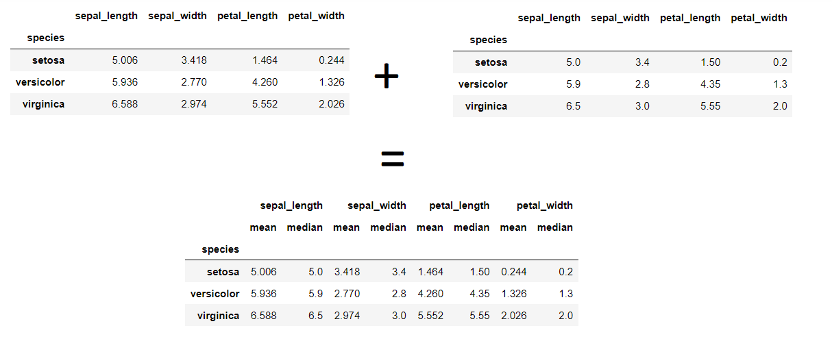
The above image indicates the mean and median values for all features for target species is similar. Therefore there is more possibility that there is no outliner in data.
Significance Test on a single variable for Anomaly Detection
We can use the following significance tests to detect any outliers in a column.
- One Sample T-Test: It tells us whether the average value in the column is statistically different from a known value.
- Z-Score: Measures how many standard deviations a data point is from the mean.
- Empirical Cumulative Distribution Function (ECDF): Represents the cumulative distribution of a dataset. It is beneficial for visualizing the distribution of non-parametric data.
- Independent T-Test: It tells us whether the mean of two variable categories is the same.
- One-way ANOVA Test (F-Test): It tells us if the mean of two or more categories of variable is similar
Graphical Representation
Histograms shows the count of each variable type in the data. It shows the data central tendency (Mean Median and Mode), Range, Variance, and standard deviation.
# plotting Histogram for one Feature
plt.figure(figsize=(8, 6))
plt.hist(data.petal_length, bins=30)  # 'bins' specifies the number of bins

# Add labels and title
plt.title('Distribution of Petal Length')
plt.xlabel('Petal Length (cm)')
plt.ylabel('Frequency')

plt.show()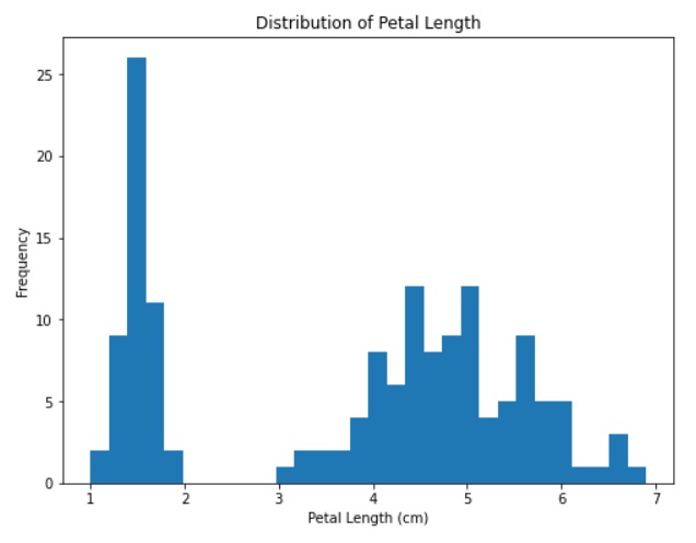
# plotting Histogram for all Features in data
data.plot.hist(bins=25, alpha=0.25, figsize=(8, 6))
# Add labels and title
plt.title('Features')
plt.xlabel('Petal Length')
plt.ylabel('Frequency')
plt.show()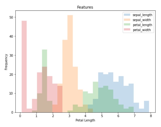
Box Plot are used to indicate where 25%, 50%, and 75% of data lies. We can identify outlines by spotting at box plot.
Box Plot for a Feature Value using Seaborn
# Set the plot size
plt.figure(figsize=(8, 6))

# Create a boxplot using Seaborn
sns.boxplot(data=data)

# Add labels and title
plt.title('Boxplot for Univariate Analysis')
plt.xlabel('Feature Name')
plt.ylabel('Length in cm')

# Show the plot
plt.show()

#Alternativerly We can also use inbuild pandas library to create the plot
#data.boxplot(figsize=(8, 5))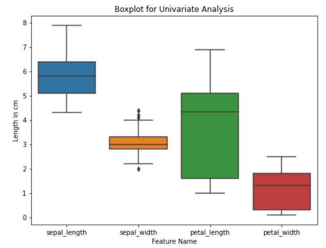
# Set the plot size
plt.figure(figsize=(8, 6))

# Create a boxplot using Seaborn
sns.boxplot(x='species', y='sepal_length', data=data)
#Similarly we can draw box plot for features against the all target values

# Add labels and title
plt.title('Boxplot for Univariate Analysis')
plt.xlabel('Target Variable')
plt.ylabel('Sepal Length in cm')

# Show the plot
plt.show()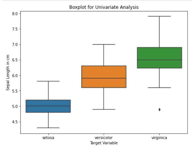
Frequency Pie Chart determines the count of each category in a column. It’s like a visual way of counting and showing the proportions.
# Count the occurrences of each species
species_counts = data['species'].value_counts()

# Set the size of the plot
plt.figure(figsize=(8, 6))

# Create a pie chart using Matplotlib
plt.pie(species_counts, labels=species_counts.index, autopct='%1.1f%%', colors=sns.color_palette('bright'))

# Add title
plt.title('Frequency Pie Chart of Univariate Analysis', fontsize=16)

# Show the plot
plt.show()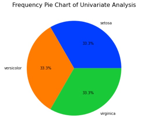
Kernel Density Plot or KDE is a non-parametric method to estimate the probability density function of a continuous random variable. We can use these plots for visualizing the distribution of a single variable or multiple variables, identifying modes.
# Set the size of the plot
plt.figure(figsize=(8, 6))

# Create kernel density plots for each species
sns.kdeplot(data=data, x='sepal_length', hue='species', fill=True, common_norm=False, palette='viridis', alpha=0.7)

# Add title and labels
plt.title('Kernel Density Plot - Sepal Length', fontsize=16)
plt.xlabel('Sepal Length', fontsize=14)
plt.ylabel('Density', fontsize=14)

# Show the plot
plt.show()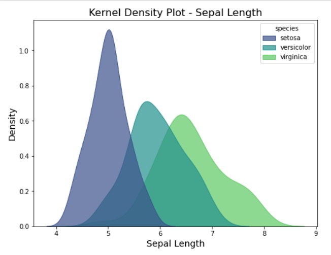
Bivariate Exploratory Data Analysis
In bivariate exploratory data analysis, we focus on the characteristics of two variables at a time. In other words, bivariate analysis analyses how change in one variable impacts the other variables. The goal of bivariate analysis is to:
- Understand the interdependence between two variables.
- Identifying patterns, trends, and associations in the data.
Here is the list of common techniques used in bivariate analysis:
The Correlation coefficient between two continuous variables gives the strength and direction of a linear relationship between them. We can use the following methods to determine the correlation between two variables:
We can use the correlation coefficient for feature selection in machine learning.
Pearson correlation coefficient: It measures the linear relationship between two continuous variables. It’s value ranges from -1 to 1. We use Pearson correlation coefficient for EDA to analyze the linear correlation between numerical variables.
# Calculate the Pearson correlation matrix
correlation_matrix = data.corr()

# Display the correlation matrix as a table
correlation_table = pd.DataFrame(correlation_matrix)
print("Pearson Correlation Coefficients")
print(correlation_table)
Spearman rank correlation coefficient
from scipy.stats import spearmanr

# Calculate the Spearman rank correlation matrix
correlation_matrix_spearman, _ = spearmanr(data)

# Display the correlation matrix as a table
correlation_table_spearman = pd.DataFrame(correlation_matrix_spearman, columns=data.columns, index=data.columns)
print("Spearman Rank Correlation Coefficients")
print(correlation_table_spearman)
Graphical methods
We can use the following graphs to determine the relation between two variables:
Line Chart: We can use a line chart to understand the relation between two numerical variables.
# Set the size of the plot
plt.figure(figsize=(8, 6))

# Create a line chart for bivariate analysis
sns.lineplot(data=data, x='sepal_length', y='sepal_width', hue='species', markers=True, style='species', palette='dark')

# Add title and labels
plt.title('Bivariate Analysis - Sepal Length vs Sepal Width', fontsize=16)
plt.xlabel('Sepal Length', fontsize=14)
plt.ylabel('Sepal Width', fontsize=14)

# Show the plot
plt.show()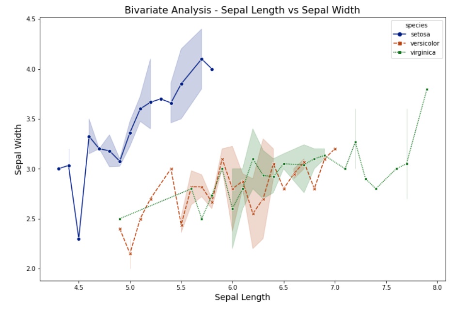
Scatter Plot: Similar to a line chart, we can use a scatter plot to understand the relation between two numerical continuous variables.
plt.figure(figsize=(12, 8))

# Create a scatter plot for bivariate analysis
sns.scatterplot(data=data, x='sepal_length', y='sepal_width', hue='species', palette='dark', marker='o')

# Add title and labels
plt.title('Scatter Plot - Sepal Length vs Sepal Width', fontsize=16)
plt.xlabel('Sepal Length', fontsize=14)
plt.ylabel('Sepal Width', fontsize=14)

# Show the plot
plt.show()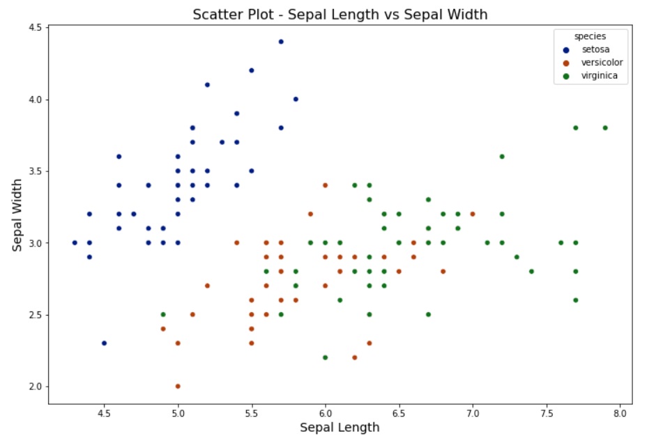
Box Plots or Violin Plots: Generally, we use the box for univariate analysis to visualize the distribution of a continuous variable across different categories. For bivariate analysis, we can use a box plot to compare the distribution of one variable across different categories.
Heatmaps or 3D plots: We can use a heatmap to visualize the relationships between two continuous variables across different categories. We will create a heatmap for the Iris dataset to display the correlation matrix between the numerical features for each species. We use heat maps and 3D plots to show the correlation between different features.
# Calculate the correlation matrix
correlation_matrix = data.corr()

plt.figure(figsize=(10, 8))

# Create a heatmap for bivariate analysis
sns.heatmap(data=correlation_matrix, annot=True, cmap='winter', fmt=".2f", annot_kws={"size": 12})
plt.title('Bivariate Analysis - Correlation Heatmap', fontsize=16)

# Show the plot
plt.show()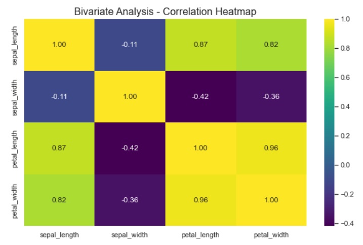
Contour Plots: We use contour plots to visualize three-dimensional relationships between two continuous variables and a response variable.
plt.figure(figsize=(8, 6))

# Create a contour plot for bivariate analysis
sns.kdeplot(data=data, x='sepal_length', y='sepal_width', fill=True, cmap='viridis')

# Add title and labels
plt.title('Bivariate Analysis - Contour Plot', fontsize=16)
plt.xlabel('Sepal Length', fontsize=14)
plt.ylabel('Sepal Width', fontsize=14)

# Show the plot
plt.show()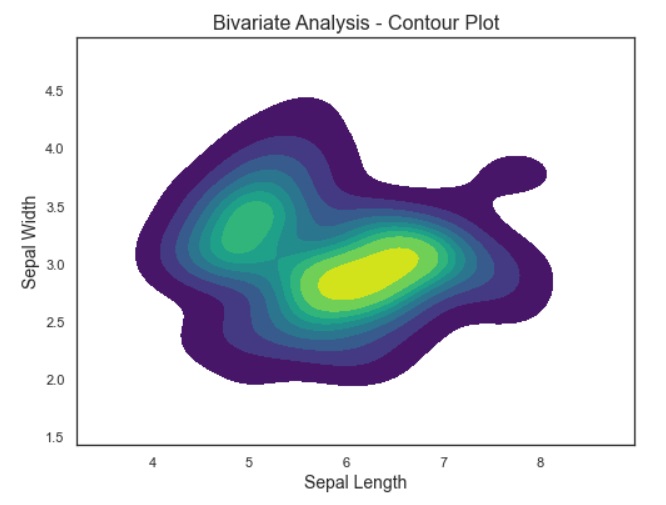
For Category Variables
Cross Frequency Table / Contingency Tables: It outputs the frequency of each unique combination of categories from two category variables.
# We will use Hypothetical customer churn dataset to understan
data_2 = {
    'customer_id': [1, 2, 3, 4, 5, 6, 7, 8, 9, 10],
    'subscription_type': ['Premium', 'Basic', 'Premium', 'Basic', 'Premium', 'Basic', 'Premium', 'Basic', 'Premium', 'Basic'],
    'payment_method': ['Credit Card', 'PayPal', 'Credit Card', 'PayPal', 'Credit Card', 'PayPal', 'Credit Card', 'PayPal', 'Credit Card', 'PayPal'],
    'churned': ['No', 'Yes', 'No', 'No', 'Yes', 'No', 'No', 'Yes', 'Yes', 'No']
}

# Create a DataFrame from the hypothetical data
customer_churn_data = pd.DataFrame(data_2)

# Create a cross-frequency table for 'subscription_type' and 'payment_method'
cross_frequency_table = pd.crosstab(index=customer_churn_data['subscription_type'], columns=customer_churn_data['payment_method'])

# Create cross-frequency table
print("\nCross-Frequency Table:\n")
print(cross_frequency_table)
Chi-Square Test: We use the Chi-Square Test to check the independence of two categorical variables.
ANOVA (Analysis of Variance): We use the ANOVA Test to check if there is a significant difference in the means of different groups.
Dependent T-Test: A dependent or paired t-test tells us whether the mean of two numerical variables is statistically same.
Group by and aggregation
- We use group by aggregation in bivariate analysis to determine relationship between two variables.
- “Group by and Aggregation” with bar chart and pie chart
Multivariate Exploratory Data Analysis
In multivariate exploratory data analysis, we focus on the characteristics of three or more variables at a time. In other words, multivariate analysis analyses the relationship between pairs of variables. Here is the list of common techniques used in multivariate analysis:
Principal Component Analysis (PCA)
Principal Component Analysis (PCA) reduces the dimensionality of data while preserving as much variability as possible. It is used to identify patterns and relationships among variables and transform them into a set of linearly uncorrelated variables. We use it when dealing with high-dimension data.
# Import Required Library
from sklearn.decomposition import PCA
from sklearn.preprocessing import StandardScaler

# Separate features and target variable
X = data.drop('species', axis=1)
y = data['species']

# Standardize the data using StandardScaler
scaler = StandardScaler()
X_standardized = scaler.fit_transform(X)

# Apply PCA
pca = PCA(n_components=2)
X_pca = pca.fit_transform(X_standardized)

# Explained variance ratio
explained_variance_ratio = pca.explained_variance_ratio_
print("Explained Variance Ratio:", explained_variance_ratio)

# Scatter plot in reduced-dimensional space
plt.figure(figsize=(10, 6))
sns.scatterplot(x=X_pca[:, 0], y=X_pca[:, 1], hue=y, palette='dark')
plt.title('Scatter Plot in Reduced-Dimensional Space')
plt.xlabel('PC-1')
plt.ylabel('PC-2')
plt.show()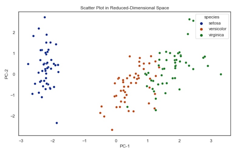
In this example, we implemented PCA to reduce the data dimensionality to two principal components, and visualize the data in the reduced-dimensional space.
Multivariate Analysis of Variance
Multivariate Analysis of Variance (MANOVA) is a statistical technique for hypothesis testing. We use it to analyze the differences among group means in a multivariate response variable. It’s an extension of the Analysis of Variance (ANOVA) for situations where there are multiple dependent variables.
import pandas as pd
import statsmodels.api as sm
from statsmodels.multivariate.manova import MANOVA
import seaborn as sns

# Example data (replace this with your actual DataFrame)
# Assuming you have a DataFrame named 'data' with numerical columns
# For illustration purposes, let's use the built-in 'iris' dataset in Seaborn
data = sns.load_dataset('iris')

# Separate features and target variable
X = data.drop('species', axis=1)
y = data['species']

# Convert 'y' to categorical variable
y_categorical = pd.Categorical(y)

# Fit MANOVA model
manova = MANOVA(X.values, y_categorical.codes)

# Print the results
print(manova.mv_test())
Graphical Methods
Pair-plot: Pair-plot is a type of Multivariate Chart that is used to monitor multiple parameters in a single graph. Pair plots from Seaborn to visualize the relation between all numerical variables.
# Create a pairplot
sns.pairplot(data, hue='species')
plt.show()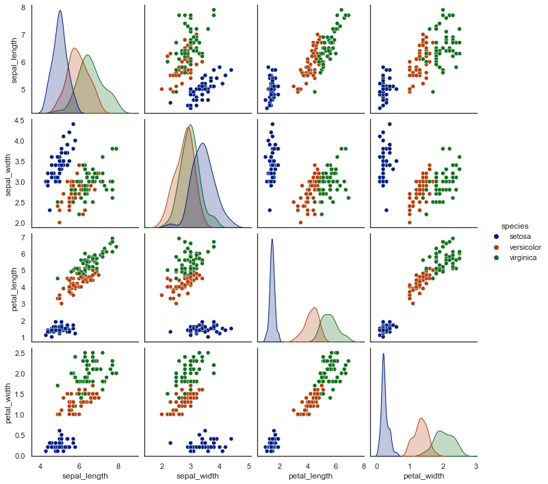
3D Scatter Plot: We use 3D scatter plot to visualize relationships between three numerical variables.
# Create a 3D scatter plot
fig = plt.figure(figsize=(12, 9))
ax = fig.add_subplot(111, projection='3d')
ax.scatter(data['sepal_length'],
           data['sepal_width'],
           data['petal_length'],
           c=data['species'].astype('category').cat.codes, cmap='cool')
ax.set_xlabel('Sepal Length')
ax.set_ylabel('Sepal Width')
ax.set_zlabel('Petal Length')
plt.title('3D Scatter Plot for Multivariate Analysis')
plt.show()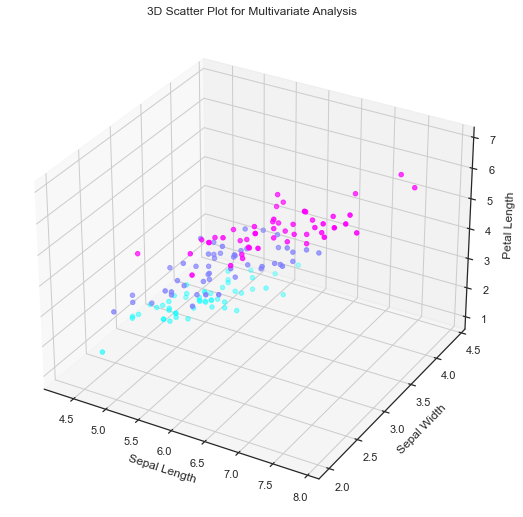
Stacked Bar Chart: We can use stacked bar charts to visualize two categorical and one numerical variable.
data_2 = {
    'customer_id': [1, 2, 3, 4, 5, 6, 7, 8, 9, 10],
    'subscription_type': ['Premium', 'Basic', 'Premium', 'Basic', 'Premium', 'Basic', 'Premium', 'Basic', 'Premium', 'Basic'],
    'payment_method': ['Credit Card', 'PayPal', 'Credit Card', 'PayPal', 'Credit Card', 'PayPal', 'Credit Card', 'PayPal', 'Credit Card', 'PayPal'],
    'churned': ['No', 'Yes', 'No', 'No', 'Yes', 'No', 'No', 'Yes', 'Yes', 'No']
}

df = pd.DataFrame(data_2)

# Create a stacked bar chart
plt.figure(figsize=(10, 6))
sns.countplot(x='subscription_type', hue='churned', data=df, palette='viridis', hue_order=['No', 'Yes'])
plt.title('Stacked Bar Chart for Customer Churn')
plt.xlabel('Subscription Type')
plt.ylabel('Count')
plt.show()
Conclusion
Exploratory data analysis or EDA is an initial and important step in machine learning algorithms to understand the data. It is used along with data Wrangling to prepare data for ML algorithms.